TYPOGRAPHIC
BOOK COVER
BOOK COVER
For a typography class, we were given the task of creating typography from an unconventional medium. It needed to be based on a book we've read and the type should be related to the nature of the book —
and so I chose Richard Roper's How not to Die Alone.
SYNOPSIS
For a quick synopsis the book revolves around Andrew, who works a grim public health job finding next of kin for those who die alone. A job not many would tolerate, but then a woman by the name of Peggy joins the team and she turns out to be a breath of fresh air in an otherwise stuffy workplace.
She makes him feel more alive than he’s felt in a long time but he hides secret- a white lie that has spiraled out of control. Now its up to him to either confess and risk losing everything, or to keep his secret and never let anyone get too close.
There were elements of the original cover that I enjoyed, such as the flowers and the mono-color nature that gave it an irreverent feel.
I went to work thumbnailing 5 different concepts with varying items that seemed pertinent to the story. A messy desk from his dreary job, a miniature train set since it’s one of Andrew’s few joys, and flowers since it’s synonymous with funerals and romance, themes that are ever present in the story.
I felt that the flowers were much more fitting and engaged in that direction for the cover design.
I had a short timeline after finalizing the direction I would be choosing for the cover design. I would not be able to press and dry the flowers myself so I decided to buy them pre-pressed and dried.
From there it was a matter of taking photos in my makeshift studio AKA my garage and a couple lamps.
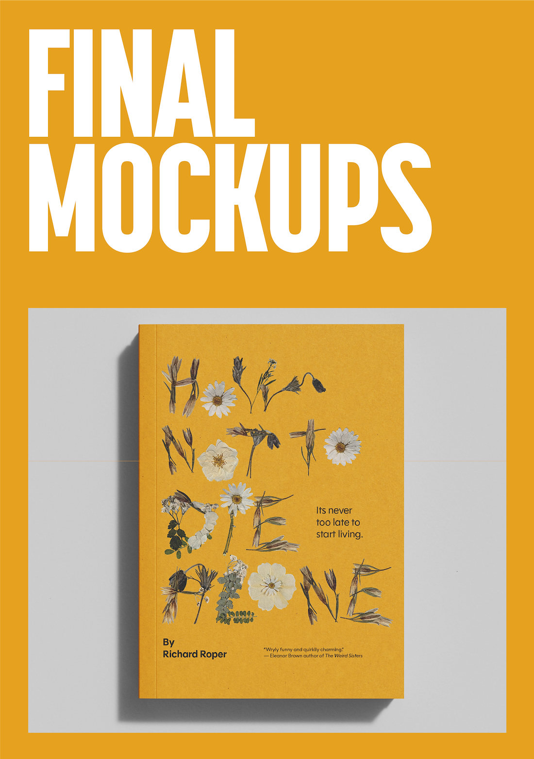
For this cover I used a 6 column and 7 row grid to ensure I had a great amount of flexibility in my design and so that everything would find its place.
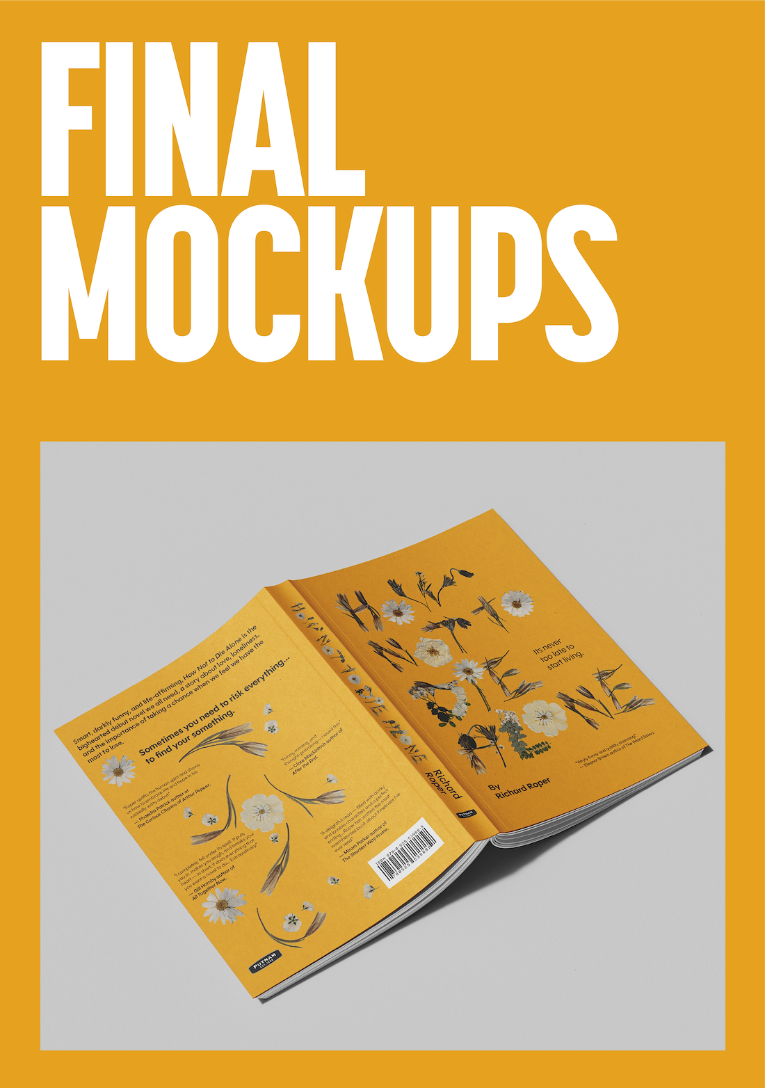
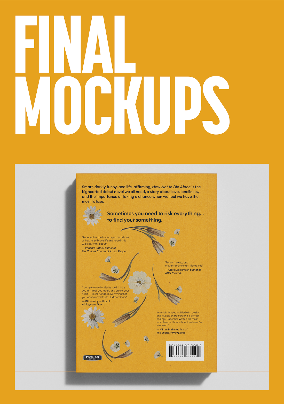
The flowers would be gridded and so would the elements that were transferred over such as the taglines, synopses, raves and reviews and the like.
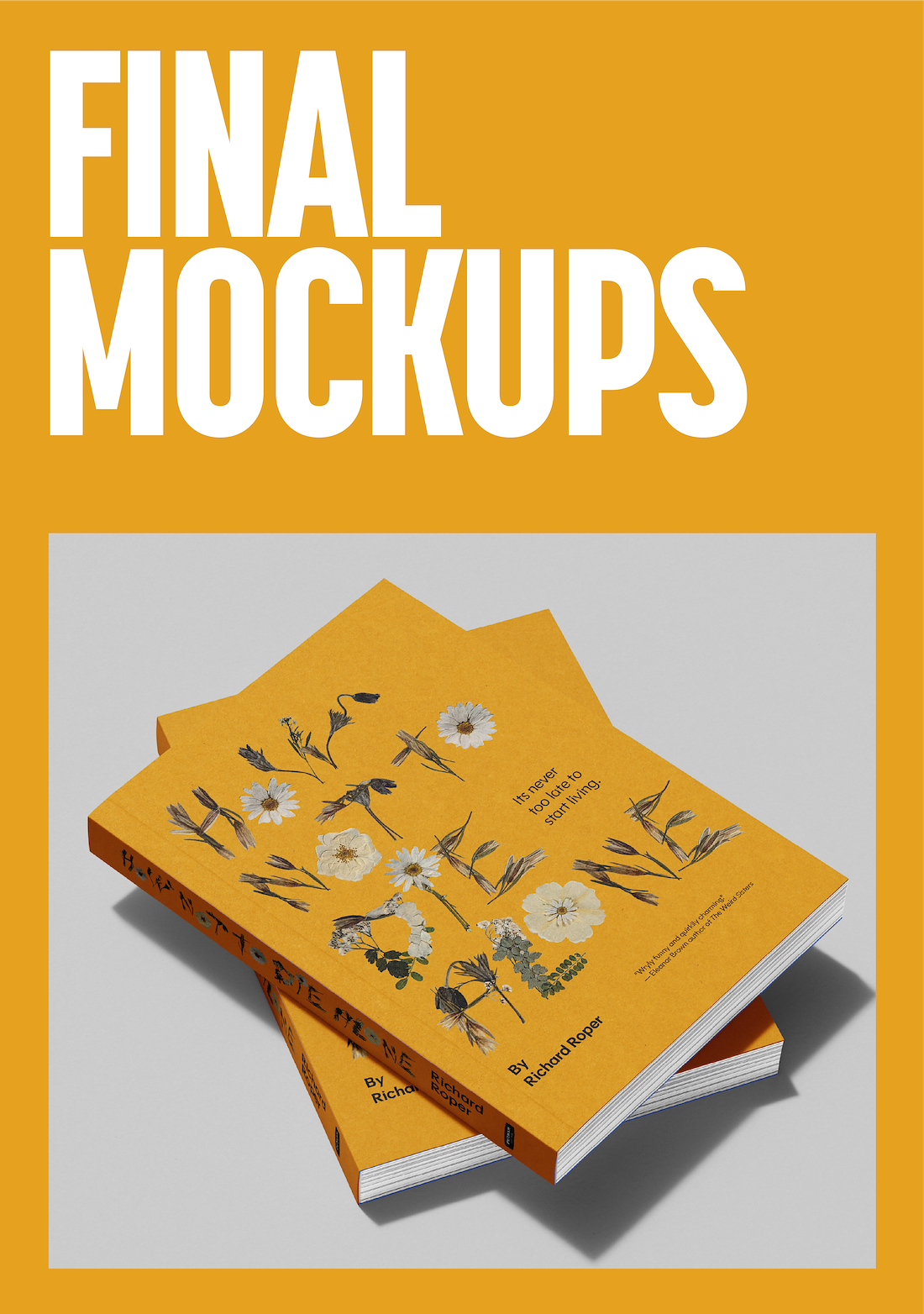
This is the final digitized design including the cover, back cover, and spine. The pressed flowers were a great touch to not only nod to the nature of funerals but also to the romance in this book both wilting and blooming. The yellow I used to counter the flowers so as to give it a sarcastic or ironic feel.
The typeface used here was the product of Oh No Type Co. and their brilliantly matter-of-fact typeface known as Polymath. I chose this typeface to pair with my unconventional type since it had, not only a friendliness to it but a geometric certainty to it that I pairs well to counter the organic nature of the title.